News from the Front
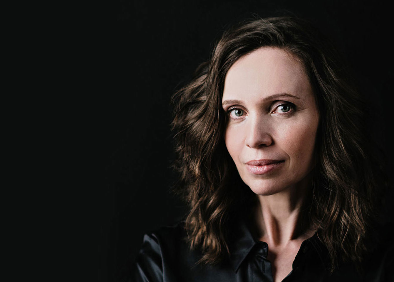
Emma Brante, in love with logos

Emma Brante,
Creative director, graphic designer
& founder at Frontline Studio
Why did you choose to specialize in logo design?
A logo is a lot of content in a very small object.
Logo design seemed to be the most creative and interesting thing there was for me to craft. Most of the design agencies I had worked for were specialized in brand identity and that didn’t stop them from working on other forms of communication tools like we do today with Masha at Frontline Studio. But one day I realized that I needed to specialize in a specific skill that required a specific know-how. Being able to create a strong and effective brand identity/logo is an added value.
From then on, I took a different approach and started to work on my logos in a more ambitious way without ever backing down from the design difficulties that can be encountered during the process. I wanted them all to have something special. Whether the project was small or large, I decided to give the client as much as I could so that each of my logos would be a strong and remarkable creative object.
When did you decide to focus on logo design and its place in brand identity?
I’ve been designing logos for 20 years but the first one I designed with this in mind was for an architects firm. I had already designed fonts for a logo, notably when I created the logo for the ready-to-wear brand Maje, but I wasn’t used to really designing and transforming typography in a complex way, so I spent a considerable amount of time on this project to make it look original and special.
The client wanted to get away from the usual codes associated with architects. The brief was very original, the partners wanted a conquering, rock-inspired attitude. They were ambitious and that inspired me. They loved the logo of the rock band ACDC. They wanted the same strength for their agency. That was the starting point and I designed the logo around the idea of a skyline.
It’s from that project that I’ve allowed myself to transform, draw, distort typography and get into a territory where few people dare to go. In my opinion, if you touch the design of a letter that is perfectly designed and formatted, you have to make it interesting and meaningful, otherwise you ruin it and there is no added value compared to its initial design.
What has this changed in your work?
Based on a highly identifiable logo, the overall visual identity of a brand can gain power without resorting to aesthetic tactics such as expensive printing or often artificial effects. If a logo is very elaborate, rich and complex, it will not cost more to print. On the other hand, it will give strength to the whole brand identity and everyone will enjoy using it.
This is the interesting point of view in logo design. The idea is to draw out what is strongest about the client and then extract it and put the brand into orbit. Whatever the message is, I always thought it was my job to make it extraordinary and unique. To function, a logo must radiate.
What do you think a logo brings to your client?
Firstly, making a logo is like tailoring a suit for someone. The brand is the central character. Often when we meet the client, they have a suit that is too big or too small, or no suit at all. It’s up to us to get it back to the right size so that the brand is legible, looks sincere and is illuminated in its best light.
Then our job is to increase the brand’s potential for success. Of course, the turnover will not be entirely based on the visual identity, but it will play a role in the bundle of qualities necessary for its success.
With a strong identity, the brand will be more recognizable, identifiable, it will express its heritage, history, reputation and ambitions. A visual identity is an opportunity to make a mark and to multiply the brand’s aura.